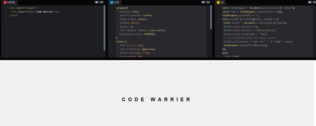
Text Animation Gsap
GSAP, short for GreenSock Animation Platform, is a powerful JavaScript library for creating high-performance animations. To create a Text animation GSAP, you can follow these steps:
Step 1:
The structure is organized as follows:
<div class="wrapper">: This is a<div>element with a class attribute set to “wrapper”.<div>is a container element used to group other elements together. The class attribute is used to apply CSS styles or to target this element with JavaScript.<h1 class="title">Code Warrier</h1>: This is a heading level 1 (<h1>) element with a class attribute set to “title”. It contains the text “Code Warrier”. Headings (<h1>,<h2>,<h3>, etc.) are used to define the structure of a web page, with<h1>typically being the main heading. The class attribute here allows for styling or targeting this heading separately.
Create Text Animation Gsap Using Html like below:
					<!DOCTYPE html>
<html lang="en">
<head>
  <meta charset="UTF-8">
  <meta name="viewport" content="width=device-width, initial-scale=1.0">
  <link rel="stylesheet" href="styles.css">
</head>
<body>

<div class="wrapper">
  <h1 class="title">Code Warrier</h1>
</div>


  <script src="https://cdnjs.cloudflare.com/ajax/libs/gsap/3.9.1/gsap.min.js"></script>
</body>
</html>
Step 2:
This CSS code provides styling instructions for the HTML elements with the class names “wrapper” and “title”, which are defined in the HTML code you provided earlier. Let’s break down each part:
For .wrapper:
display: flex;: This property defines a flex container, allowing the children elements to be laid out in a flex layout. This is often used for creating flexible and responsive layouts.justify-content: center;: This property aligns the flex items along the main axis of the flex container, which in this case is horizontally, centering them.align-items: center;: This property aligns the flex items along the cross axis of the flex container, which in this case is vertically, centering them.height: 100vh;: This sets the height of the wrapper to 100% of the viewport height (vhstands for viewport height), ensuring that it covers the entire height of the visible screen.margin: 0;: This removes any default margins around the wrapper element.font-family: "Inter", sans-serif;: This sets the font family to “Inter”, a specific font, and then falls back to a generic sans-serif font if “Inter” is not available.background-color: #f0f0f0;: This sets the background color of the wrapper to a light grayish color (#f0f0f0).
For .title:
font-size: 1.9em;: This sets the font size of the title to 1.9 times the default font size.text-transform: uppercase;: This transforms the text of the title to uppercase.letter-spacing: 0.5em;: This adds spacing between the letters of the title.font-weight: 600;: This sets the font weight of the title to a bold value.display: inline-block;: This changes the display behavior of the title to inline-block, allowing it to be positioned inline like text but still have block-like properties such as setting width and height.line-height: 1em;: This sets the line height of the title to 1 times the font size, ensuring that the text is vertically centered within its container.
Overall, these CSS styles work together to create a centered and visually appealing layout for the HTML elements with the classes “wrapper” and “title”.
CSS Styling:
Create Text Animation Gsap Using Css like below:
					.wrapper{
   display: flex;
   justify-content: center;
   align-items: center;
   height: 100vh;
   margin: 0;
   font-family: "Inter", sans-serif;
   background-color: #f0f0f0;
}
.title {
   font-size: 1.9em;
   text-transform: uppercase;
   letter-spacing: 0.5em;
   font-weight: 600;
   display: inline-block;
   line-height: 1em;
}
Step 3:
This code is a combination of JavaScript and GSAP (GreenSock Animation Platform) animation library to create a typewriter effect for the text content inside an HTML element with the class “title”. Let’s break it down step by step:
const textWrapper = document.querySelector(".title");: This line selects the HTML element with the class “title” using thedocument.querySelector()method and stores it in the variabletextWrapper.const text = textWrapper.textContent.trim();: This line retrieves the text content from the selected HTML element and removes any leading or trailing whitespace using thetrim()method, storing the result in the variabletext.textWrapper.innerHTML = "";: This line clears the HTML content of the selected element, preparing it to be filled with individual spans for each character of the text.text.split("").forEach((char, index) => { ... });: This code splits the text into an array of individual characters and iterates over each character usingforEach(). For each character:- It creates a new
<span>element. - Sets its CSS properties such as opacity, display, and lineHeight.
- Assigns the character as text content to the span, using a non-breaking space (
\xa0) for empty spaces. - Appends the created span to the textWrapper element.
- It creates a new
GSAP Animation:
- The GSAP library is used to create a timeline for the animation, which repeats indefinitely (
repeat: -1). - The animation sequence is defined using
.fromTo()and.to()methods. .fromTo(".title span", { ... }, { ... }): This animates each<span>element within the HTML element with the class “title” from a starting state to an ending state..timeline()creates a new timeline instance, which allows chaining of animation methods.- In the first animation (
fromTo), the spans are animated from a starting position where they are 100px below their initial position (y: 100) with 0 opacity to their original position with full opacity (y: 0,opacity: 1). This creates an effect of the characters appearing one by one with a specified ease and duration, staggered with a delay between each character. - In the second animation (
to), the spans are animated from their original position to 100px above their original position with 0 opacity (y: -100,opacity: 0). This creates an effect of the characters disappearing one by one with a specified ease, duration, and staggered delay.
- The GSAP library is used to create a timeline for the animation, which repeats indefinitely (
Overall, this code creates a typewriter effect where each character of the text content inside the HTML element with the class “title” appears and disappears sequentially with animation using GSAP.
Create Text Animation Gsap Using Js like below:
					const textWrapper = document.querySelector(".title");
const text = textWrapper.textContent.trim();
textWrapper.innerHTML = "";
text.split("").forEach((char, index) => {
 const letter = document.createElement("span");
 letter.style.opacity = 0;
 letter.style.display = "inline-block";
 letter.style.lineHeight = "1em";
 // non-breaking space for empty spaces
 letter.textContent = char === " " ? "\xa0" : char;
 textWrapper.appendChild(letter);
});
gsap
 .timeline({
  repeat: -1
 })
 .fromTo(
  ".title span",
  {
   y: 100,
   opacity: 0
  },
  {
   y: 0,
   opacity: 1,
   ease: "power4.out",
   duration: 1.4,
   stagger: {
    amount: 0.3,
    from: "end"
   }
  }
 )
 .to(".title span", {
  y: -100,
  opacity: 0,
  ease: "power4.in",
  duration: 1.2,
  stagger: {
   amount: 0.3,
   from: "start"
  },
  delay: 0.1
 });

