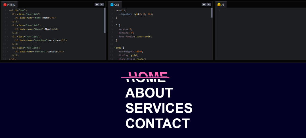
Split animation on hover
Here, we create a split animation on hover using HTML, CSS and JS.
Project Folder Structure
Before we start coding we take a look at the project folder structure. We start by creating a folder called – “split animation on hover” Inside this folder, we have 2 files. Create these files like below:
- index.html
- style.css
Step 1:
The structure is organized as follows:
-
<ul id="nav">:- This is an unordered list (
<ul>) element. - It has an
idattribute with the value “nav”. Thisidis unique within the page and can be used to apply CSS styles or to manipulate the element with JavaScript.
- This is an unordered list (
-
<li class="nav-link">:- Each list item (
<li>) inside the unordered list represents a navigation link. - The
classattribute is set to “nav-link”, which allows for styling and selecting these elements collectively with CSS or JavaScript.
- Each list item (
-
<h1 data-name="home">Home</h1>:- Inside each list item is an
<h1>element, which typically represents a top-level heading. - The
data-nameattribute is a custom data attribute (part of the HTML5 standard) that stores additional information. Here, it holds values like “home”, “About”, “services”, and “contact”. - The content of the
<h1>tag is the text that will be displayed on the webpage, such as “Home”, “About”, “services”, and “contact”.
- Inside each list item is an
HTML Markup: Start by creating the HTML structure for your split animation on hover. For example:
					<!DOCTYPE html>
<html lang="en">
<head>
  <meta charset="UTF-8">
  <meta name="viewport" content="width=device-width, initial-scale=1.0">
  <link rel="stylesheet" href="styles.css">
</head>
<body>
<ul id="nav">
	<li class="nav-link">
		<h1 data-name="home">Home</h1>
	</li>
	<li class="nav-link">
		<h1 data-name="About">About</h1>
	</li>
	<li class="nav-link">
		<h1 data-name="services">services</h1>
	</li>
	<li class="nav-link">
		<h1 data-name="contact">contact</h1>
	</li>
</ul>


</body>
</html>
Step 2:
This code is for styling image wrappers and images using CSS. Let’s break it down:
:rootis a CSS pseudo-class that matches the document’s root element. It is similar to thehtmlelement.--bgcoloris a CSS custom property (variable) that is set to the colorrgb(2, 0, 36). This variable can be reused throughout the CSS.- The
*selector targets all elements. margin: 0;andpadding: 0;remove default spacing around all elements.font-family: sans-serif;sets the default font for all elements to a sans-serif typeface.min-height: 100vh;ensures the body is at least the full height of the viewport.display: grid;andplace-items: center;center-aligns the content within the body both horizontally and vertically.background: var(--bgcolor);sets the background color to the value of the--bgcolorvariable.color: white;sets the text color to white.list-style: none;removes the default bullet points from list items.font-size: 5rem;sets the font size to 5 rem units.position: relative;makes the element a positioned element, allowing the use of::beforeand::afterpseudo-elements.text-transform: uppercase;transforms the text to uppercase.transition: all 300ms ease;applies a smooth transition effect to all properties over 300 milliseconds.width: fit-content;makes the width of the element fit its content.cursor: pointer;changes the cursor to a pointer when hovering over the element.transform: skew(10deg);skews the element by 10 degrees when hovered.content: attr(data-name);sets the content to the value of thedata-nameattribute of the h1 element.position: absolute;positions the pseudo-element absolutely within the h1.top: 0; left: -20px;positions it slightly above and to the left of the h1.background: var(--bgcolor);sets the background to the--bgcolorvariable.height: 3rem;sets the height to 3 rem units.overflow: hidden;hides any overflow content.transition: all 300ms ease;applies a transition effect.padding-left: 20px;adds padding on the left.- Moves the pseudo-element slightly when the h1 is hovered and changes the color to hotpink.
- Creates an empty pseudo-element.
- Sets its height to 4px and initial width to 0.
- Positions it in the center of the h1.
- Sets the background to hotpink
CSS Styling:
					:root {
	--bgcolor: rgb(2, 0, 36);
}

* {
	margin: 0;
	padding: 0;
	font-family: sans-serif;
}

body {
	min-height: 100vh;
	display: grid;
	place-items: center;
	background: var(--bgcolor);
	color: white;
}
ul {
	list-style: none;
}
h1 {
	font-size: 5rem;
	position: relative;
	text-transform: uppercase;
	transition: all 300ms ease;
	width: fit-content;
	cursor: pointer;
}
h1:hover {
	transform: skew(10deg);
}
h1::before {
	content: attr(data-name);
	position: absolute;
	top: 0;
	left: -20px;
	background: var(--bgcolor);
	height: 3rem;
	overflow: hidden;
	transition: all 300ms ease;
	padding-left: 20px;
}
h1:hover::before {
	top: -3px;
	left: 0px;
	color: hotpink;
}

h1::after {
	content: "";
	height: 4px;
	width: 0;
	position: absolute;
	top: 50%;
	left: 50%;
	transform: translate(-50%, -50%);
	background: hotpink;
	transition: all 300ms ease;
}
h1:hover::after {
	width: 120%;
	outline: 5px solid rgb(2, 0, 36);
}

