
Fancy Text Animation
Here, we create fancy text animation on hover using HTML, CSS and JS.
Project Folder Structure
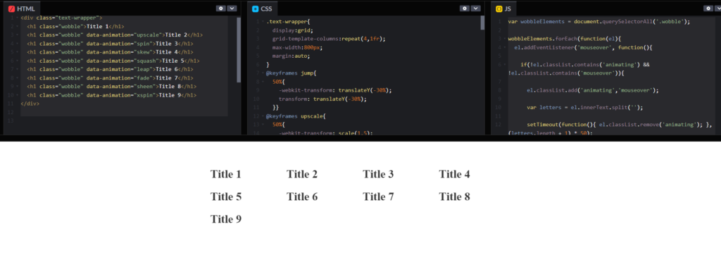
Before we start coding we take a look at the project folder structure. We start by creating a folder called – “fancy text” Inside this folder, we have 2 files. Create these files like below:
- index.html
- style.css
- script.js
HTML
We create fancy text animation on hover using HTML code. Copy the code below and paste it into your index.html file.
					<div class="text-wrapper">
  <h1 class="wobble">Title 1</h1>
  <h1 class="wobble" data-animation="upscale">Title 2</h1>
  <h1 class="wobble" data-animation="spin">Title 3</h1>
  <h1 class="wobble" data-animation="skew">Title 4</h1>
  <h1 class="wobble" data-animation="squash">Title 5</h1>
  <h1 class="wobble" data-animation="leap">Title 6</h1>
  <h1 class="wobble" data-animation="fade">Title 7</h1>
  <h1 class="wobble" data-animation="sheen">Title 8</h1>
  <h1 class="wobble" data-animation="xspin">Title 9</h1>
</div>
CSS
We create fancy text animation on hover using CSS code. Copy the code below and paste it into your style.css file.
					.text-wrapper{
  display:grid;
  grid-template-columns:repeat(4,1fr);
}
@keyframes jump{
  50%{
		-webkit-transform: translateY(-30%);
		transform: translateY(-30%);
  }}
@keyframes upscale{
	50%{
		-webkit-transform: scale(1.5);
		transform: scale(1.5);
}}
@keyframes spin{
	50%{
		-webkit-transform: rotate(180deg);
		transform: rotate(180deg);
}}
@keyframes squash{
	50%{
		-webkit-transform: scaleY(0);
		transform: scaleY(0);
}}
@keyframes skew{
	50%{
		-webkit-transform: skew(-30deg);
		transform: skew(-30deg);
}}
@keyframes leap{
	50%{
		-webkit-transform: translateY(-50%) rotate(-15deg);
		transform: translateY(-50%) rotate(-15deg);
}}
@keyframes fade{
	50%{
		-webkit-transform: translateY(50%);
		transform: translateY(50%);
		opacity: 0
}}
@keyframes sheen{
	50%{
		-webkit-transform: translateY(-10%);
		transform: translateY(-10%);
		color: #eee;
}}
@keyframes xspin{
	50%{
		-webkit-transform: scaleX(0);
		transform: scaleX(0);
}}
body{
	padding: 40px;
	font-family: 'Baloo Thambi 2';
	color: #333;
}
h1{
	font-size: 30px;
	font-weight: 800;
	cursor: default;
	margin-bottom: 5px;
	float: left;
	clear: left;
  width:fit-content;
}
span{
		display: inline-block;
		pointer-events: none;
}
span.jump{
  animation: jump 0.5s 1}
span.upscale{
  animation: upscale 0.5s 1}
	span.spin{
		animation: spin 0.5s 1}
	span.skew{
		animation: skew 0.5s 1}
	span.squash{
		animation: squash 0.5s 1;
		-webkit-transform-origin: bottom;
		transform-origin: bottom}
	span.leap{
		animation: leap 0.7s 1}
	span.fade{
		animation: fade 0.5s 1}
	span.sheen{
		animation: sheen 0.3s 1}
	span.xspin{
		animation: xspin 0.5s 1}

.info{
	background: #f6f6f6;
	padding: 30px;
	margin-bottom: 50px;
	border-radius: 4px;
	box-shadow: 0 20px 50px -45px #333;
	max-width: 600px;
}
	p{
		font-size: 18px;
		line-height: 1.4;
}
	p + p{
		margin-top: 20px;
}
a{
		color: coral;
		text-decoration: none;
}
JS
Finally, we add functionality in fancy text animation on hover using JavaScript. Copy the code below and paste it into your script.js file.
					var wobbleElements = document.querySelectorAll('.wobble');

wobbleElements.forEach(function(el){
	el.addEventListener('mouseover', function(){

		if(!el.classList.contains('animating') && !el.classList.contains('mouseover')){

			el.classList.add('animating','mouseover');

			var letters = el.innerText.split('');

			setTimeout(function(){ el.classList.remove('animating'); }, (letters.length + 1) * 50);

			var animationName = el.dataset.animation;
			if(!animationName){ animationName = "jump"; }

			el.innerText = '';

			letters.forEach(function(letter){
				if(letter == " "){
					letter = " ";
				}
				el.innerHTML += '<span class="letter">'+letter+'</span>';
			});

			var letterElements = el.querySelectorAll('.letter');
			letterElements.forEach(function(letter, i){
				setTimeout(function(){
					letter.classList.add(animationName);
				}, 50 * i);
			});

		}

	});

	el.addEventListener('mouseout', function(){
		el.classList.remove('mouseover');
	});
});
CODEPEN
Watch Some Other Topics