

Glitch Text Animation
Here, we glitch text animation using HTML and CSS.
Project Folder Structure
Before we start coding we take a look at the project folder structure. We start by creating a folder called – “Glitch Text Animation” Inside this folder, we have 2 files. Create these files like below:
- index.html
- style.css
HTML
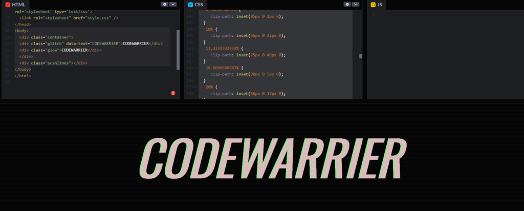
We create glitch text animation using HTML code. Copy the code below and paste it into your index.html file.
					<body>
  <div class="container">
  <div class="glitch" data-text="CODEWARRIER">CODEWARRIER</div>
  <div class="glow">CODEWARRIER</div>
  </div>
  <div class="scanlines"></div>
</body>
CSS
We create glitch text animation using CSS code. Copy the code below and paste it into your style.css file.
					body {
	 background: black;
	 font-family: "Oswald", sans-serif;
	 font-style: italic;
}
 .container {
	 position: absolute;
	 transform: translate(-50%, -50%);
	 top: 40%;
	 left: 50%;
}
 .glitch, .glow {
	 color: #dfbfbf;
	 position: relative;
	 font-size: 9vw;
	 animation: glitch 5s 5s infinite;
}
 .glitch::before, .glow::before {
	 content: attr(data-text);
	 position: absolute;
	 left: -2px;
	 text-shadow: -5px 0 magenta;
	 background: black;
	 overflow: hidden;
	 top: 0;
	 animation: noise-1 3s linear infinite alternate-reverse, glitch 5s 5.05s infinite;
}
 .glitch::after, .glow::after {
	 content: attr(data-text);
	 position: absolute;
	 left: 2px;
	 text-shadow: -5px 0 lightgreen;
	 background: black;
	 overflow: hidden;
	 top: 0;
	 animation: noise-2 3s linear infinite alternate-reverse, glitch 5s 5s infinite;
}
 @keyframes glitch {
	 1% {
		 transform: rotateX(10deg) skewX(90deg);
	}
	 2% {
		 transform: rotateX(0deg) skewX(0deg);
	}
}
 @keyframes noise-1 {
	 3.3333333333% {
		 clip-path: inset(69px 0 1px 0);
	}
	 6.6666666667% {
		 clip-path: inset(66px 0 35px 0);
	}
	 10% {
		 clip-path: inset(74px 0 15px 0);
	}
	 13.3333333333% {
		 clip-path: inset(6px 0 82px 0);
	}
	 16.6666666667% {
		 clip-path: inset(69px 0 22px 0);
	}
	 20% {
		 clip-path: inset(3px 0 57px 0);
	}
	 23.3333333333% {
		 clip-path: inset(81px 0 14px 0);
	}
	 26.6666666667% {
		 clip-path: inset(60px 0 12px 0);
	}
	 30% {
		 clip-path: inset(72px 0 16px 0);
	}
	 33.3333333333% {
		 clip-path: inset(99px 0 2px 0);
	}
	 36.6666666667% {
		 clip-path: inset(79px 0 3px 0);
	}
	 40% {
		 clip-path: inset(28px 0 10px 0);
	}
	 43.3333333333% {
		 clip-path: inset(80px 0 18px 0);
	}
	 46.6666666667% {
		 clip-path: inset(76px 0 9px 0);
	}
	 50% {
		 clip-path: inset(23px 0 35px 0);
	}
	 53.3333333333% {
		 clip-path: inset(30px 0 17px 0);
	}
	 56.6666666667% {
		 clip-path: inset(65px 0 1px 0);
	}
	 60% {
		 clip-path: inset(81px 0 17px 0);
	}
	 63.3333333333% {
		 clip-path: inset(89px 0 4px 0);
	}
	 66.6666666667% {
		 clip-path: inset(82px 0 6px 0);
	}
	 70% {
		 clip-path: inset(13px 0 66px 0);
	}
	 73.3333333333% {
		 clip-path: inset(34px 0 16px 0);
	}
	 76.6666666667% {
		 clip-path: inset(3px 0 62px 0);
	}
	 80% {
		 clip-path: inset(86px 0 13px 0);
	}
	 83.3333333333% {
		 clip-path: inset(36px 0 55px 0);
	}
	 86.6666666667% {
		 clip-path: inset(29px 0 64px 0);
	}
	 90% {
		 clip-path: inset(26px 0 56px 0);
	}
	 93.3333333333% {
		 clip-path: inset(37px 0 26px 0);
	}
	 96.6666666667% {
		 clip-path: inset(18px 0 78px 0);
	}
	 100% {
		 clip-path: inset(99px 0 1px 0);
	}
}
 @keyframes noise-2 {
	 0% {
		 clip-path: inset(42px 0 41px 0);
	}
	 3.3333333333% {
		 clip-path: inset(38px 0 16px 0);
	}
	 6.6666666667% {
		 clip-path: inset(85px 0 1px 0);
	}
	 10% {
		 clip-path: inset(66px 0 22px 0);
	}
	 13.3333333333% {
		 clip-path: inset(25px 0 49px 0);
	}
	 16.6666666667% {
		 clip-path: inset(90px 0 5px 0);
	}
	 20% {
		 clip-path: inset(56px 0 17px 0);
	}
	 23.3333333333% {
		 clip-path: inset(70px 0 13px 0);
	}
	 26.6666666667% {
		 clip-path: inset(66px 0 22px 0);
	}
	 30% {
		 clip-path: inset(57px 0 10px 0);
	}
	 33.3333333333% {
		 clip-path: inset(96px 0 2px 0);
	}
	 36.6666666667% {
		 clip-path: inset(50px 0 37px 0);
	}
	 40% {
		 clip-path: inset(2px 0 33px 0);
	}
	 43.3333333333% {
		 clip-path: inset(85px 0 8px 0);
	}
	 46.6666666667% {
		 clip-path: inset(87px 0 10px 0);
	}
	 50% {
		 clip-path: inset(66px 0 28px 0);
	}
	 53.3333333333% {
		 clip-path: inset(41px 0 9px 0);
	}
	 56.6666666667% {
		 clip-path: inset(57px 0 14px 0);
	}
	 60% {
		 clip-path: inset(8px 0 73px 0);
	}
	 63.3333333333% {
		 clip-path: inset(88px 0 11px 0);
	}
	 66.6666666667% {
		 clip-path: inset(76px 0 17px 0);
	}
	 70% {
		 clip-path: inset(64px 0 27px 0);
	}
	 73.3333333333% {
		 clip-path: inset(71px 0 2px 0);
	}
	 76.6666666667% {
		 clip-path: inset(25px 0 5px 0);
	}
	 80% {
		 clip-path: inset(11px 0 58px 0);
	}
	 83.3333333333% {
		 clip-path: inset(73px 0 28px 0);
	}
	 86.6666666667% {
		 clip-path: inset(34px 0 64px 0);
	}
	 90% {
		 clip-path: inset(60px 0 8px 0);
	}
	 93.3333333333% {
		 clip-path: inset(72px 0 7px 0);
	}
	 96.6666666667% {
		 clip-path: inset(93px 0 6px 0);
	}
	 100% {
		 clip-path: inset(84px 0 12px 0);
	}
}
 .scanlines {
	 overflow: hidden;
	 mix-blend-mode: difference;
}
 .scanlines::before {
	 content: "";
	 position: absolute;
	 width: 100%;
	 height: 100%;
	 top: 0;
	 left: 0;
	 background: repeating-linear-gradient(to bottom, transparent 0%, rgba(255, 255, 255, 0.05) 0.5%, transparent 1%);
	 animation: fudge 7s ease-in-out alternate infinite;
}
 @keyframes fudge {
	 from {
		 transform: translate(0px, 0px);
	}
	 to {
		 transform: translate(0px, 2%);
	}
}
 .glow {
	 text-shadow: 0 0 1000px #dfbfbf;
	 color: transparent;
	 position: absolute;
	 top: 0;
}
 .subtitle {
	 font-family: Arial, Helvetica, sans-serif;
	 font-weight: 100;
	 font-size: 0.8vw;
	 color: rgba(165, 141, 141, .4);
	 text-transform: uppercase;
	 letter-spacing: 1em;
	 text-align: center;
	 position: absolute;
	 left: 17%;
	 animation: glitch-2 5s 5.02s infinite;
}
 @keyframes glitch-2 {
	 1% {
		 transform: rotateX(10deg) skewX(70deg);
	}
	 2% {
		 transform: rotateX(0deg) skewX(0deg);
	}
}
CODEPEN
Watch Some Other Topics